🟥 Red Form
Schema-driven React form system that builds entire UI — no HTML, no CSS. Define once. Render anywhere. Fully typed, flexible, and lightning-fast.


🚀 Why RED FORM?
Building forms in React often means juggling inputs, styles, and validation logic for every single field. Red Form solves that by letting you define the schema only once — it automatically generates the UI, handles validation, manages state, and aligns everything perfectly.
You get developer clarity, instant layout, and zero boilerplate.
✨ Features
- 🧱 Schema-driven – define once, render everywhere
- 🎨 No HTML/CSS needed – automatic layout, focus, hover, spacing, and shadows
- ⚙️ Type-safe – fully typed schema and form instance
- 🧩 Extensible – inject custom components and validation logic
- 🚀 Optimized – minimal re-renders, built for scalability
- 💡 Declarative logic – dynamic visibility and branching made easy
- 🪶 Extreamly Light Weight – 56kb package can save your multiple hours
- 🪲Low Code - Low or Less code means less chance of BUG.
📦 Installation
VS Code1npm install red-form
2# or
3yarn add red-form
🧩 Example 1 — Create Product Form
A simple and elegant example showing Red Form’s minimal setup.
VS Code1import Form, { create } from "red-form";
2import "red-form/dist/index.css";
3
4const productForm = create({
5  name: {
6    label: "Product Name",
7    component: "text",
8    value: "",
9    required: true,
10  },
11  category: {
12    label: "Category",
13    component: "select",
14    options: ["Electronics", "Clothing", "Books", "Other"],
15    value: "",
16    required: true,
17  },
18  price: {
19    label: "Price ($)",
20    component: "number",
21    value: 0,
22    min: 0,
23    required: true,
24  },
25  available: {
26    label: "In Stock",
27    component: "switch",
28    value: true,
29  },
30  description: {
31    label: "Description",
32    component: "textarea",
33    value: "",
34    span: 12,
35  },
36});
37
38export default function CreateProduct() {
39  return (
40    <Form
41      title="Add New Product"
42      description="Fill in the details below to list your product."
43      schema={productForm}
44      onSubmit={(values) => {
45        alert(JSON.stringify(values, null, 2));
46      }}
47    />
48  );
49}
⚙️ Example 2 — Dynamic Form + Custom Component
Dynamic field rendering and asynchronous file uploads — all declaratively.
VS Code1import Form, { create } from "red-form";
2
3const schema = create({
4  title: {
5    label: "Project Title",
6    component: "text",
7    value: "",
8    required: true,
9  },
10  category: {
11    label: "Category",
12    component: "select",
13    options: ["Web", "Mobile", "AI", "IoT"],
14    value: "",
15    required: true,
16  },
17  image: {
18    label: "Cover Image",
19    component: "image",
20    value: "",
21    onSelect: async (file) => {
22      const reader = new FileReader();
23      return new Promise((resolve) => {
24        reader.onloadend = () => resolve(reader.result as string);
25        reader.readAsDataURL(file);
26      });
27    },
28  },
29  isPrivate: {
30    label: "Private Project",
31    component: "switch",
32    value: false,
33  },
34  password: {
35    label: "Access Password",
36    component: "password",
37    value: "",
38    hidden: (form) => !form.values.isPrivate,
39  },
40  customFooter: {
41    label: "Custom Note",
42    component: "custom",
43    inputBase: false,
44    render: () => (
45      <div style={{ padding: 12, background: "#f5f5f5", borderRadius: 6 }}>
46        <small>All fields are auto-validated before submit ✅</small>
47      </div>
48    ),
49    span: 12,
50  },
51});
52
53export default function ProjectForm() {
54  return <Form title="New Project" description="Quickly configure and submit your project details." schema={schema} onSubmit={(values) => console.log("Submitted:", values)} />;
55}
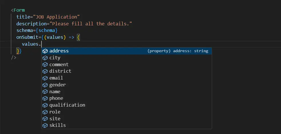
👩💼 Example 3 — Job Application Form (Real-world)
A large, production-grade form built entirely through schema configuration.
VS Code1import Form, { create } from "red-form";
2
3export default function JobApplication() {
4  const schema = create({
5    name: {
6      label: "Name",
7      component: "text",
8      value: "",
9      autoFill: "name",
10      required: true,
11      max: 20,
12    },
13    email: {
14      label: "Email",
15      component: "text",
16      value: "",
17      autoFill: "email",
18      required: true,
19      max: 30,
20    },
21    phone: {
22      label: "Phone",
23      component: "text",
24      value: "",
25      autoFill: "home tel",
26      required: true,
27      max: 10,
28    },
29    address: {
30      label: "Address",
31      component: "text",
32      value: "",
33      autoFill: "address-line1",
34      required: true,
35      max: 20,
36    },
37    city: {
38      label: "City",
39      component: "text",
40      value: "",
41      autoFill: "address-level3",
42      required: true,
43      max: 20,
44    },
45    district: {
46      label: "District",
47      component: "text",
48      value: "",
49      autoFill: "address-level2",
50      required: true,
51      max: 20,
52    },
53    state: {
54      label: "State",
55      component: "text",
56      value: "",
57      autoFill: "address-level3",
58      required: true,
59      max: 20,
60    },
61    zipcode: {
62      label: "Pincode",
63      component: "text",
64      value: "",
65      autoFill: "postal-code",
66      required: true,
67      max: 6,
68    },
69    role: {
70      label: "Role",
71      component: "search",
72      value: "",
73      options: ["frontend", "backend", "sales", "bidder", "analyst", "architect", "DBA"],
74      required: true,
75    },
76    gender: {
77      label: "Gender",
78      component: "radio",
79      value: "",
80      options: ["Male", "Female", "Other"],
81    },
82    qualification: {
83      label: "Highest Qualification",
84      component: "checkbox",
85      value: "", // INITIAL VALUE BLANK QUOTE ON CHECKBOX COMPONENT WILL ALLOW SINGLE CHECK AT A TIME.
86      options: ["Diploma", "B.Tech", "M.Tech"],
87      required: true,
88    },
89    site: {
90      label: "Preferred Site (multi select)",
91      component: "checkbox",
92      value: [], // INITIAL VALUE BLANK ARRAY ON CHECKBOX COMPONENT WILL ALLOW MULTI SELECT.
93      options: ["on-site", "remote"],
94      required: true,
95    },
96    skills: {
97      label: "Skills",
98      component: "multi-select",
99      value: [],
100      span: 12,
101      options: ["react", "angular", "node.js", "php"],
102      required: true,
103    },
104    comment: {
105      label: "Comment",
106      component: "textarea",
107      value: "",
108      span: 12,
109    },
110  });
111
112  return (
113    <div className="border-3 border-border-strong border-solid px-6 py-8 rounded-lg">
114      <Form title="Job Application" description="Please fill all the details carefully." schema={schema} onSubmit={(values) => console.log(values)} />
115    </div>
116  );
117}
👩💼 Example 4 — LogIn Form Schema (Real-world)
VS Code1const schema = create({
2  username: {
3    label: "username",
4    component: "text",
5    value: "",
6    autoFill: "email",
7    required: true,
8  },
9  password: {
10    label: "password",
11    component: "password",
12    value: "",
13    required: true,
14  },
15});
👩💼 Example 5 — SignUp Form Schema (Real-world)
VS Code1const schema = create({
2  name: {
3    label: "Name",
4    component: "text",
5    value: "",
6    autoFill: "name",
7    required: true,
8  },
9  email: {
10    label: "email",
11    component: "text",
12    value: "",
13    autoFill: "email",
14    required: true,
15  },
16  password: {
17    label: "password",
18    component: "password",
19    value: "",
20    required: true,
21  },
22});
🧩 This example demonstrates:
- 10+ field types (text, select, radio, checkbox, switch, textarea, search, etc.)
- Built-in autoFill support
- Multi-column layout via span
- Zero external UI dependency — all styling and alignment handled by Red Form
🧩 Components
💎 Common Props available in all components
VS Code1{
2 label: string;
3  required?: boolean;
4  placeholder?: string;
5  helperText?: ReactNode;
6  information?: string;
7  disabled?: boolean;
8  span?: 1 | 2 | 3 | 4 | 5 | 6 | 7 | 8 | 9 | 10 | 11 | 12;
9  validate?: ({ field, props, form }) => string[];
10  hidden?: boolean;
11  adorment?: Adorment;
12}
Label is always mandatory.
🛡️ Validate Function
The validate function expects from you to return string of array.
VS Code1const schema = create({
2	field: {
3		component: "text";
4		value: "",
5		validate: ({field, props, form})=>{
6			const errors:string[] = [];
7			const value = form.values[field];
8			if(!value.startsWith('http')) errors.push(`${props.label} must start with "http".`)
9			return errors;
10		}
11	}
12})
ⓘ Information
The content of information will be shown as tooltip at the side of label.
🤝 Helper Text
The content of helperText will be shown as below the input field.
🚫 Disabled
if disabled is true then field will become readOnly can't edit that field.
👻 Hidden
if hidden is true then field will not shown in the form can be used in spacial cases.
🤔 Placeholder
The content of placeholder will be shown... Ok just guese it, I am not telling this.
📿Adorment
Through Adorment You can add some element like button, icons, div at the start or end of the INPUT field.
VS Code1{
2  start?: ReactNode ;
3  end?: ReactNode ;
4}
🗒️Text
Text field is most commonly used to handel single line string value input.
VS Code1{
2   component: "text";
3  value: string; // Initial Value
4  autoFill?: AutoFillField; // Browser supported AutoFill
5  min?: number;  // minimum length
6  max?: number; // maximum length
7}
🖹 TextArea
Text Area is just a multiline text field.
VS Code1{
2   component: "textarea";
3  value: string; // Initial Value
4  min?: number;  // minimum length
5  max?: number; // maximum length
6  span: 12;
7}
🖹 Number
In Number Field you can only enter number.
VS Code1{
2   component: "number";
3  value: number; // Initial Value
4  min?: number;  // minimum value
5  max?: number; // maximum value
6  step?: number; // per step value
7}
🔑 Password
It rendered as password field, you can't see entered value.
VS Code1{
2   component: "password";
3  value: string; // Initial Value
4  min?: number;  // minimum value
5  max?: number; // maximum value
6}
🔽 Select
Select prop will be renderd as dropdown field.
VS Code1{
2  component: "select";
3  value: string | number; // Initial Value
4  options: Option[]; // string[] or {label: string; value: string | number}[]
5  reloadOptions?: boolean;
6}
🔍 Search
Search Field is a dropdown which is searchable.
VS Code1{
2  component: "search";
3  value: string | number; // Initial Value
4  autoFill?: AutoFillField; // Same Browser AutoFIlls
5  options: Option[]; // string[] or {label: string; value: string | number}[]
6  reloadOptions?: boolean;
7}
🏷️ Tags
Tags can hold multiple user entered string values.
VS Code1{
2  component: "tags";
3  value: string[]; // Initial Value
4  min?: number;  // minimum value
5  max?: number; // maximum value
6}
🔽🔍 Multi Select
Multi-Select is mixture of tags and search field, can pick searchable multiple values.
VS Code1{
2  component: "multi-select";
3  value: string[]; // Initial Value
4  options: Option[]; // string[] or {label: string; value: string | number}[]
5  min?: number;  // minimum number of selected values
6  max?: number; // maximum number of selected values
7}
⇆ Switch
Switch are toogle button commonly used to pick boolean values.
VS Code1{
2  component: "switch";
3  value: boolean; // Initial Value
4}
🔴 Radio
Radio Group is used pick single value from option. good for 2 or 3 values.
VS Code1{
2  component: "radio";
3  value: string;
4  direction?: "row" | "column";
5  options: Option[]; // string[] or {label: string; value: string | number}[]
6}
─•──── Range
Range component will be rendered as a slider.
VS Code1{
2   component: "range";
3  value: number; // Initial Value
4  min?: number;  // minimum value
5  max?: number; // maximum value
6  step?: number; // per step value
7}
🌈 Color
VS Code1{
2   component: "color";
3  value: string[]; // Initial Value (#ffffff, #ff0000)
4}
🌄 Image
In image component you have to add onSelect prop to handel picked file and convert it into url.
VS Code1{
2   component: "image";
3  value: string; // Initial Value ( link or dataurl)
4  onSelect: (file: File) => Promise<string>; The uploader function
5}
✅ Checkbox Single Value
VS Code1{
2  component: "checkbox";
3  value: string | undefined;
4  direction?: "row" | "column"; // default "row"
5  options:  Option[]; // string[] or { label: string; value: string | number }[]
6}
✅✅ Checkbox Multi Value
VS Code1{
2  component: "checkbox";
3  value: string[]; // initial value must be string of array.
4  direction?: "row" | "column"; // default "row"
5  options:  Option[]; // string[] or { label: string; value: string | number }[]
6}
📅 Date
The value pattern of Date is 2025-11-02 (YYYY-MM-DD).
VS Code1{
2  component: "date";
3  value: "";
4  min?: string;
5  max?: string;
6}
📅🕘 Date Time
The value pattern of Date Time is 2025-11-02T14:20 (YYYY-MM-DDTHH:mm).
VS Code1{
2  component: "datetime";
3  value: "";
4  min?: string;
5  max?: string;
6}
🕘 Time
The value pattern of time is 13:26 (HH:mm)
VS Code1{
2  component: "time";
3  value: "";
4  min?: string;
5  max?: string;
6}
📅 Week
The value pattern of week is 2025-32 (YYYY-WW) for 32th week of 2025.
VS Code1{
2  component: "week";
3  value: "";
4  min?: string;
5  max?: string;
6}
🗓 Month
The value pattern of Month is 2025-04 (YYYY-MM) for April.
VS Code1{
2  component: "month";
3  value: "";
4  min?: string;
5  max?: string;
6}
✨ Custom
Custom component will allow you to render anything in place of the form field.
VS Code1{
2  component: "custom";
3  value?: any;
4  inputBase?: boolean;
5  render: ({ field, props, form }) => ReactNode;
6}
🎨 Styling with sx
VS Code1<Form
2  schema={schema}
3  sx={{
4    title: { color: "#e11d48", fontWeight: 700 },
5    submitButton: { background: "#e11d48", color: "#fff" },
6    inputBase: { borderRadius: 8, borderColor: "#ddd" },
7  }}
8/>
🧑💻 Author
Manish Gun 💻 GitHub • 🌐 Website • ✉️ [email protected]
🪪 License
MIT © Manish Gun